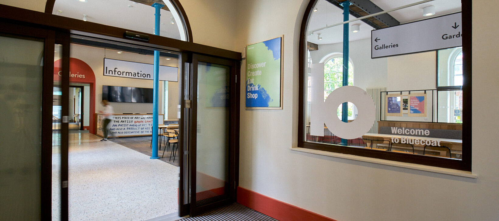
You may have noticed that Bluecoat is looking a bit different these days...
During lockdown, we worked with Manchester-based agency Modern Designers to develop our new brand and a playful visual identity that’s currently being rolled out across the organisation.
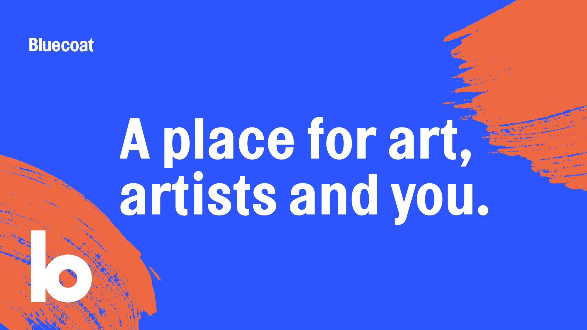
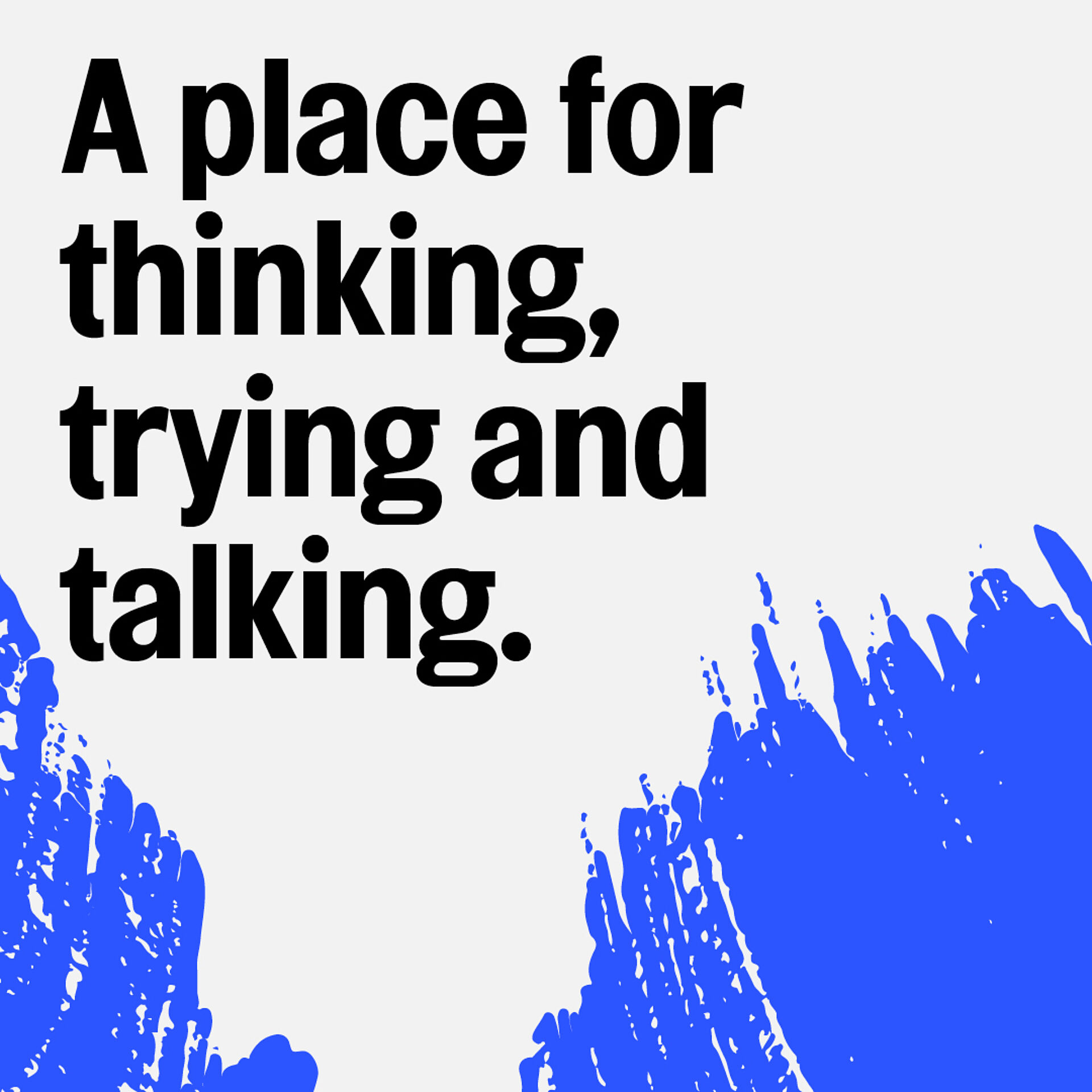
Working with Modern Designers, we wanted to bring the Bluecoat’s image up to date, reflect the contemporary nature of the programme, and its friendly and inclusive personality. When we set out, we wanted to create a brand with meaning and purpose, that could flex from serious and authoritative to fun and playful. People experience the Bluecoat in such different ways and we wanted to be able to get that across.
Working in close partnership with stakeholders, senior staff and trustees, Modern Designers helped articulate a new core purpose for the organisation. Along with a set of brand pillars, this purpose provided the brief for the creation of the Bluecoat’s identity.
The identity has typography at its core. The logo – based on the ‘b’ of the Bluecoat, using a condensed form of the typeface Topol – can be used as a playful graphic device or pattern, or more simply to support the organisation’s wordmark. The typographic structure allows communications to feel friendly or serious, depending on whether upper or lower case is selected.
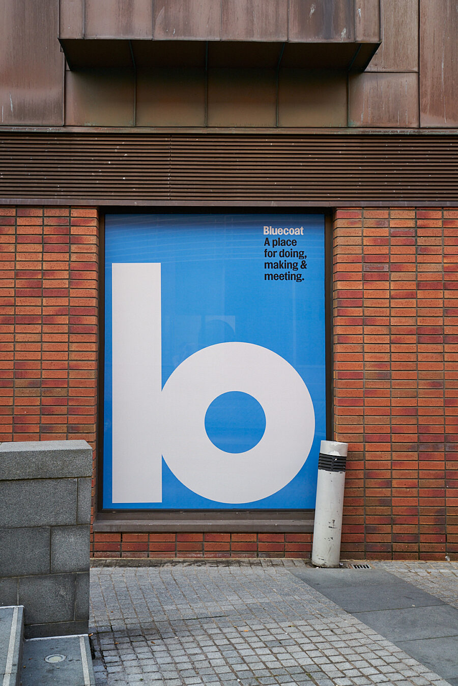
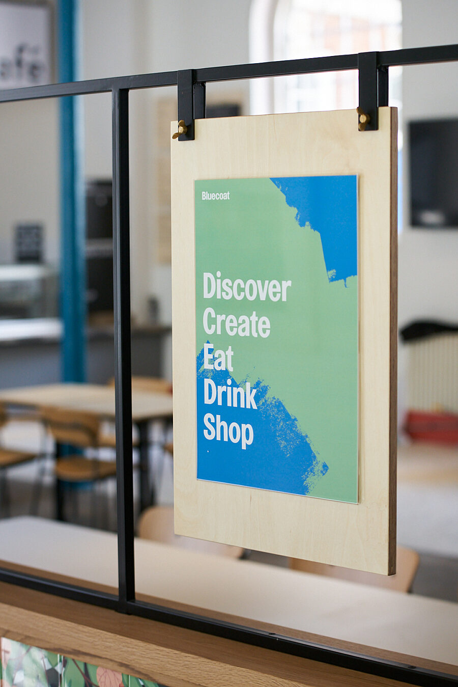
The identity contains further graphic elements: core and extended colour palettes, a set of bespoke illustrations, and a suite of painterly textures that can be overlaid onto images. Each was designed to work as part of motion design or animated graphics – so that the Bluecoat’s identity could come to life on screen as much as on the page.
Playful, flexible and with the ability to be tailored to different audiences, activities and needs, each graphic element is also rooted in what happens at the heart of the Bluecoat: the making of art.